
Role
Lead Product Designer
Company
Telegraph Special Projects
Timeline
June – November 2024
Introduction
I lead design for the 2024 US Presidential Elections, working directly with engineering and editorial leads, in the UK and US, to ensure a smooth presentation in such turbulent times. I created bespoke pages that allowed users to follow the events leading up to, and on, results day, as well as the Primaries in early 2024. These pages worked alongside a collection of Particles that were placed in-article, on live blogs, and on the homepage during key dates providing vital context to a British reader base
Project challenges
Explain and contextualise the US Presidential Election and Primaries for a mostly British reader base.
Highlight key data across the US leading up to, and on, Election Night. Providing an appropriate suite of tools to aid journalists.
Homepage & particles
Particles are a major storytelling tool for journalists at the Telegraph. They are interactive widgets that provide information, fluidity and interactivity to the website and app. The US election utilised them extensively to highlight key wins across the US and show the progress on election night leading to Trump's win. The homepage was especially important as editorial content would release depending on how close the vote was to concluding alongside Live Blogs providing updates as they happened.
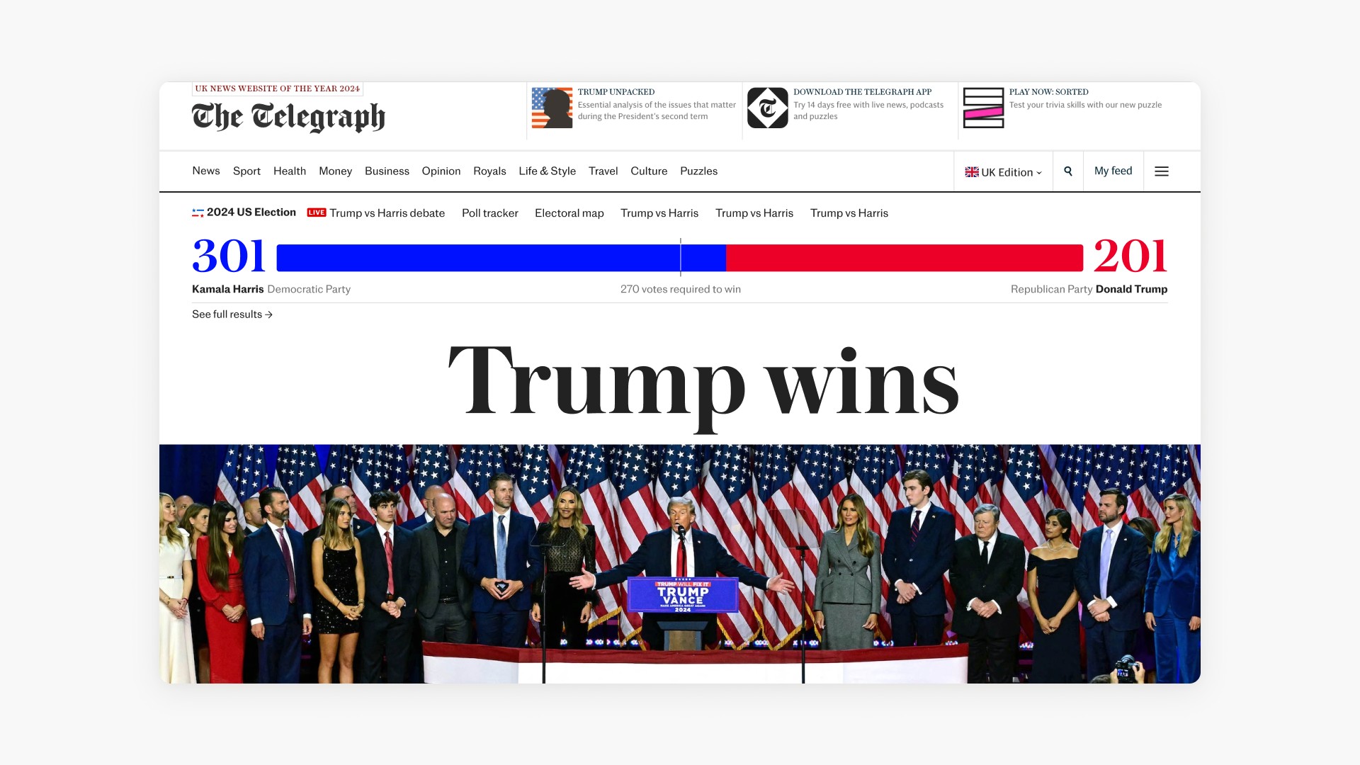

Results
The main source of information for Results Night on 5th November. It went live on the night and acted as the hub for keen readers to follow along. Had the election continued throughout the month (for example, due to recounts) it would have remained the main location for the latest US Election updates. It was a data-heavy page that aimed to break down key stats for readers that sat alongside the expert editorial content.

At it's most basic purpose, the results page showed the vote count to determine the next US President. The main Electoral vote took priority but the Popular vote, as a percentage of the population, was a major talking point, highlighting the proportion of each party's vote across the country.
On the night of 5th November, the votes are counted typically East to West. To aid British users, I crafted this hero map that filled in with colour on a state and county level view, alongside a cartogram view that represented the number of seats (thus how important) each state was. Zooming in on each state allowed users to get a deep insight into the counting progress, and ultimately vote, of each state.

As users flowed down the page, the data became more granular with some widgets focusing on the historic data to understand how it could influence the 2024 election. I brought out key map visuals, in the form of cards, to highlight the swing states that would ultimately determine the count. The swing-o-meter and turnout widgets allowed users to see how each state was voting and visualise how opinions changed on historically red or blues states. Many of these were used across the site in articles and Live Blogs, and were repurposed for the UK General Election too.

Conclusion
The election coverage in the US was a huge success for the Telegraph bringing in significant page views from the United States and over 1,000 new subscribers, surpassing all key targets for the election coverage. As the US slowly becomes a major target for Telegraph expansion in the coming years, the election merely acted as the spearhead to launch the newspaper abroad.
The project was crafted alongside the 2024 General Election with the roll-out of a similar design language & ethos, and has clearly defined the political coverage approach for the newspaper going forward: offering thought provoking articles, impactful summaries on key talking points and meaningful interactive data visualisation for the things impacting people’s daily lives.