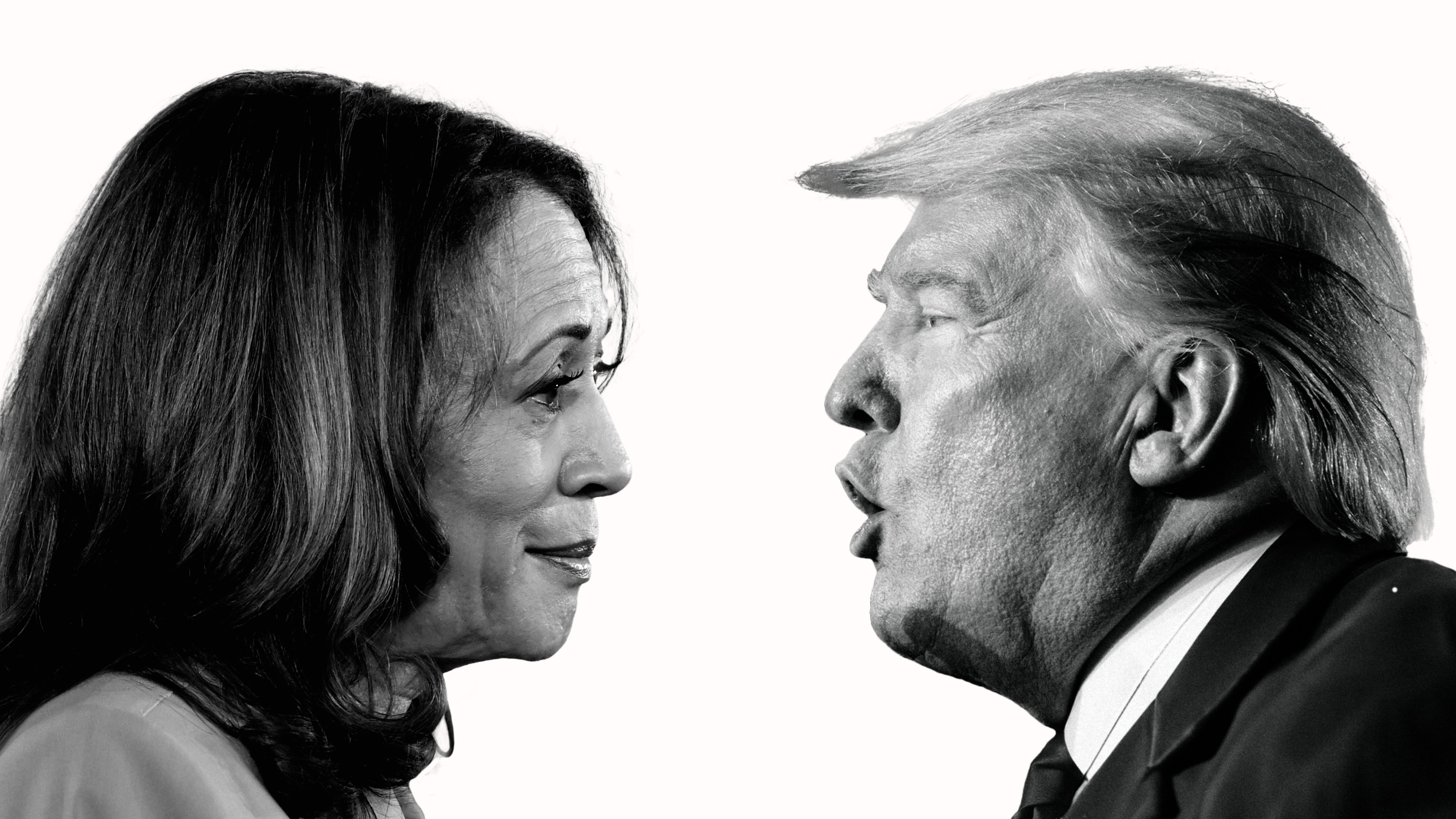

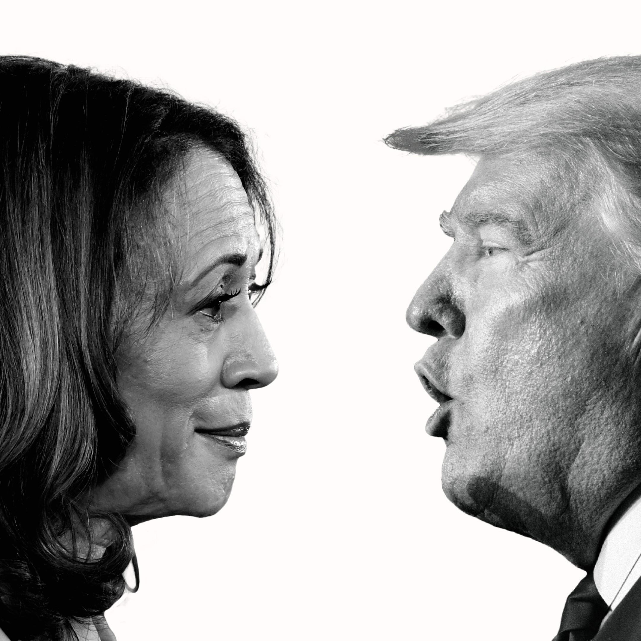
Delivering The Telegraph’s 2024 US election experience, from Primaries tracking to bespoke election night coverage with a suite of interactive tools that let readers follow events in real time. It set engagement records while standardising maps, modular layouts, and in-experience notifications that helped audiences act at decisive moments.
Project overview
My role
I led end-to-end product design across research, strategy, visual design, prototyping, user testing, and QA, defining the flows between the homepage, Primaries, and election-night results. I collaborated with a cross-functional team that included design, product designers, developers, and data journalists, partnering closely with editorial and marketing to align outcomes and execution.
Challenges
The Telegraph aimed to strengthen its US presence and grow subscribers, requiring coverage that felt authoritative to highly engaged US readers while remaining interpretable for a UK audience, excelling at SEO and discovery (Google, Apple News) while creating clear pathways into deeper tools and articles that could convert interest into sustained engagement.
Research and findings
Discovery
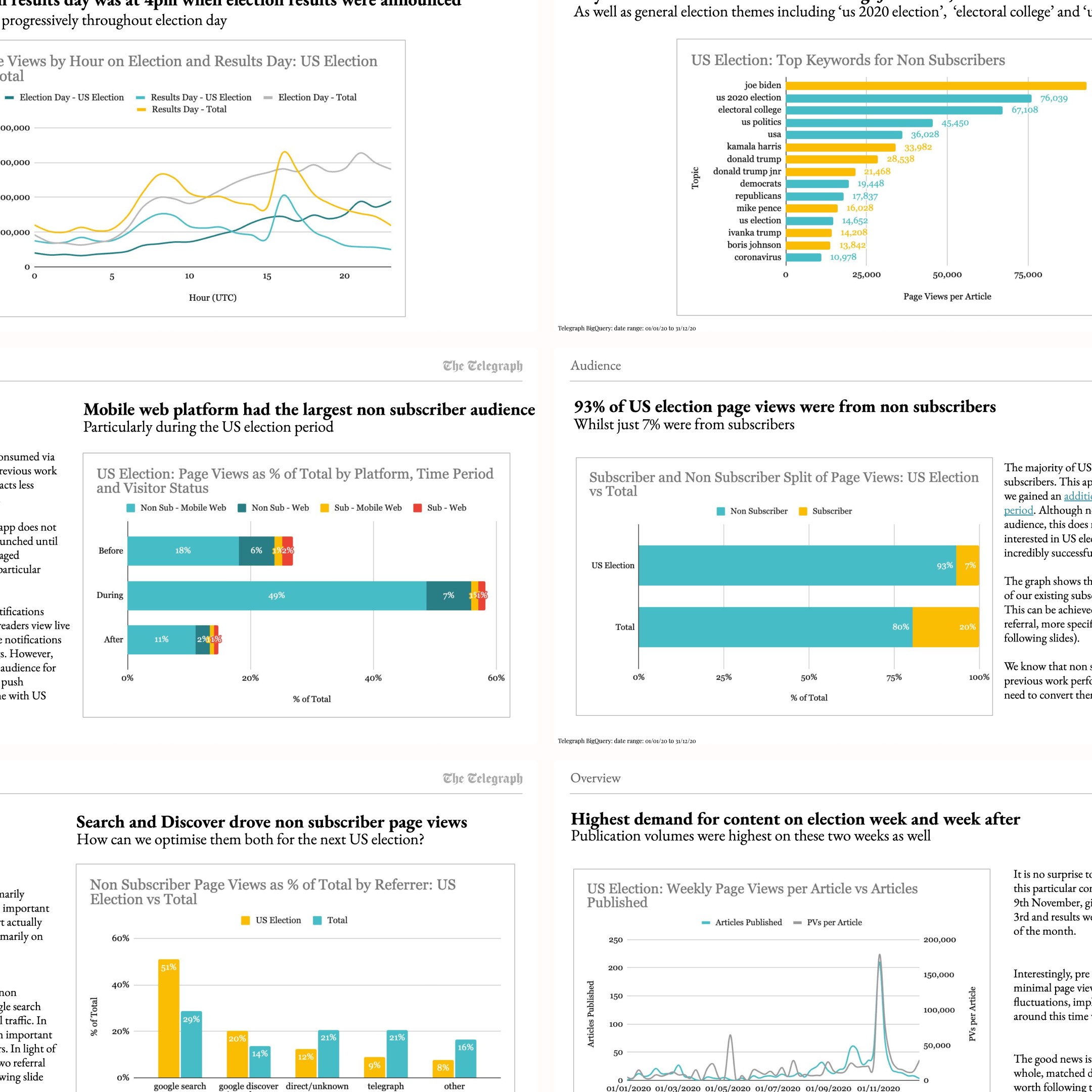
I audited performance of past election coverage: user research from past surveys and subscriber feedback; and a quantitative heatmap analysis of the website and app. I engaged the Insights and Analysis team to collaborate on folding fresh learning from the UK General Election back into the US scope. Evidence pointed to three needs: sharpen discovery for non-subscribers, express the event as unmistakably live for subscribers, and provide durable value before, during, and after the count given the likely potential recounts.

Benchmarking
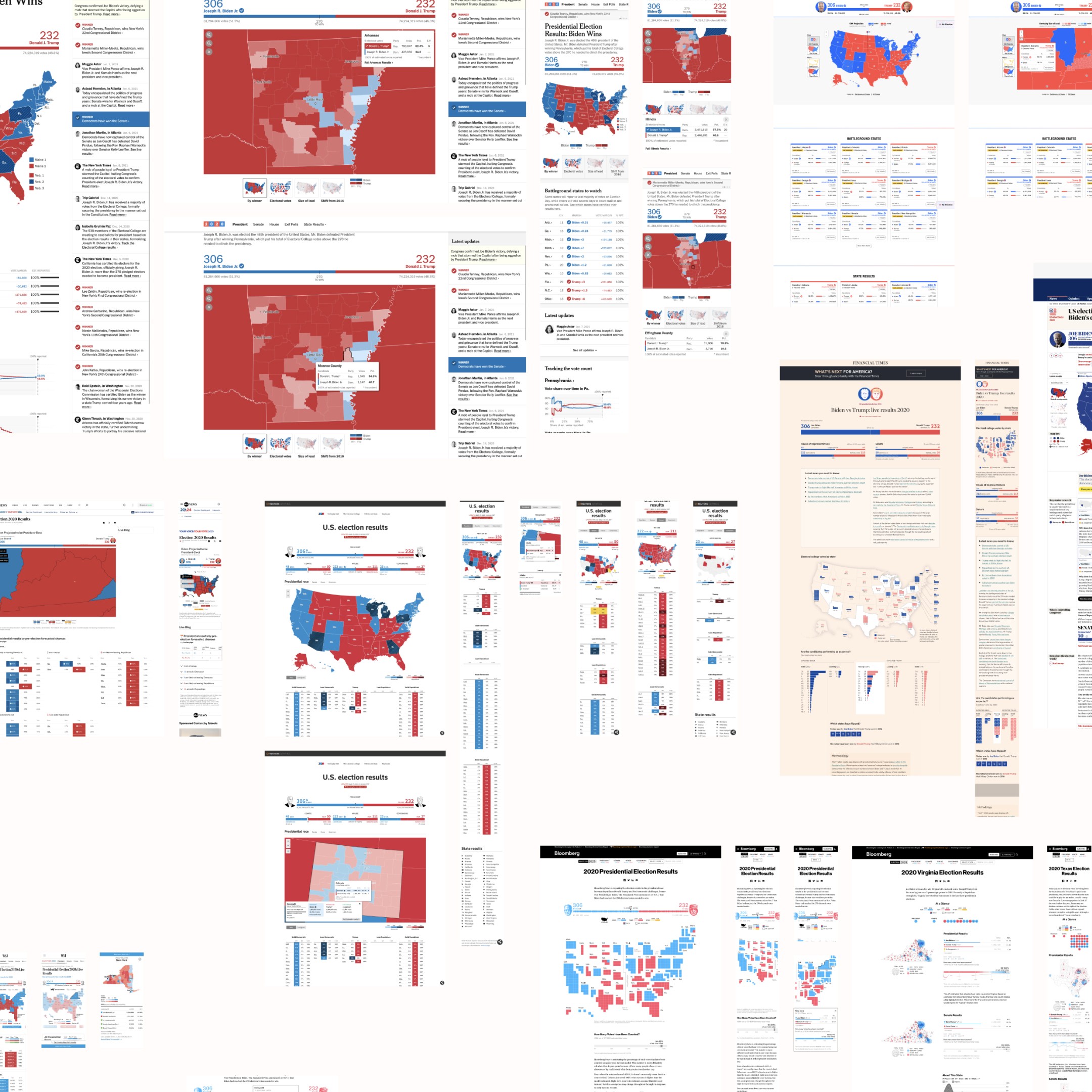
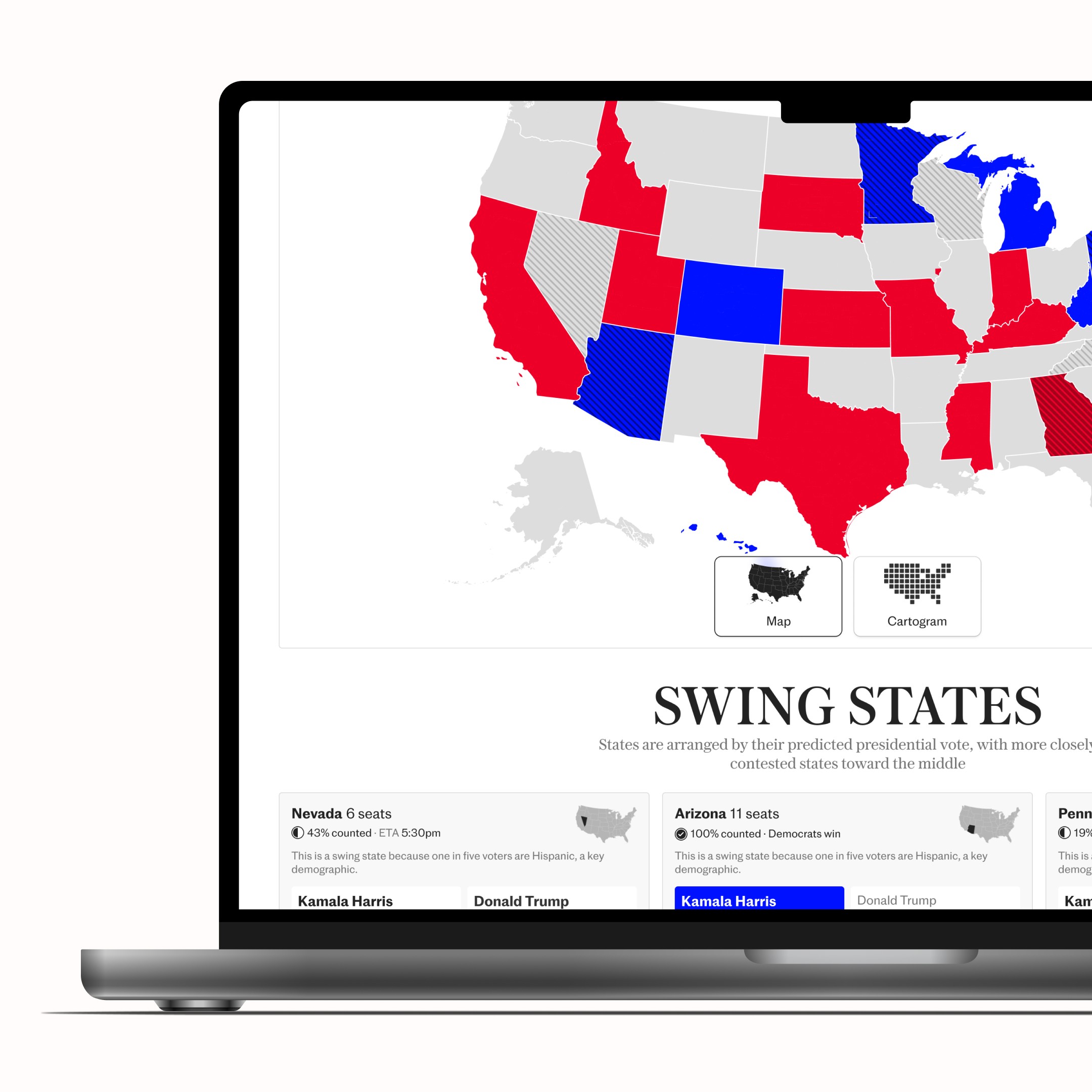
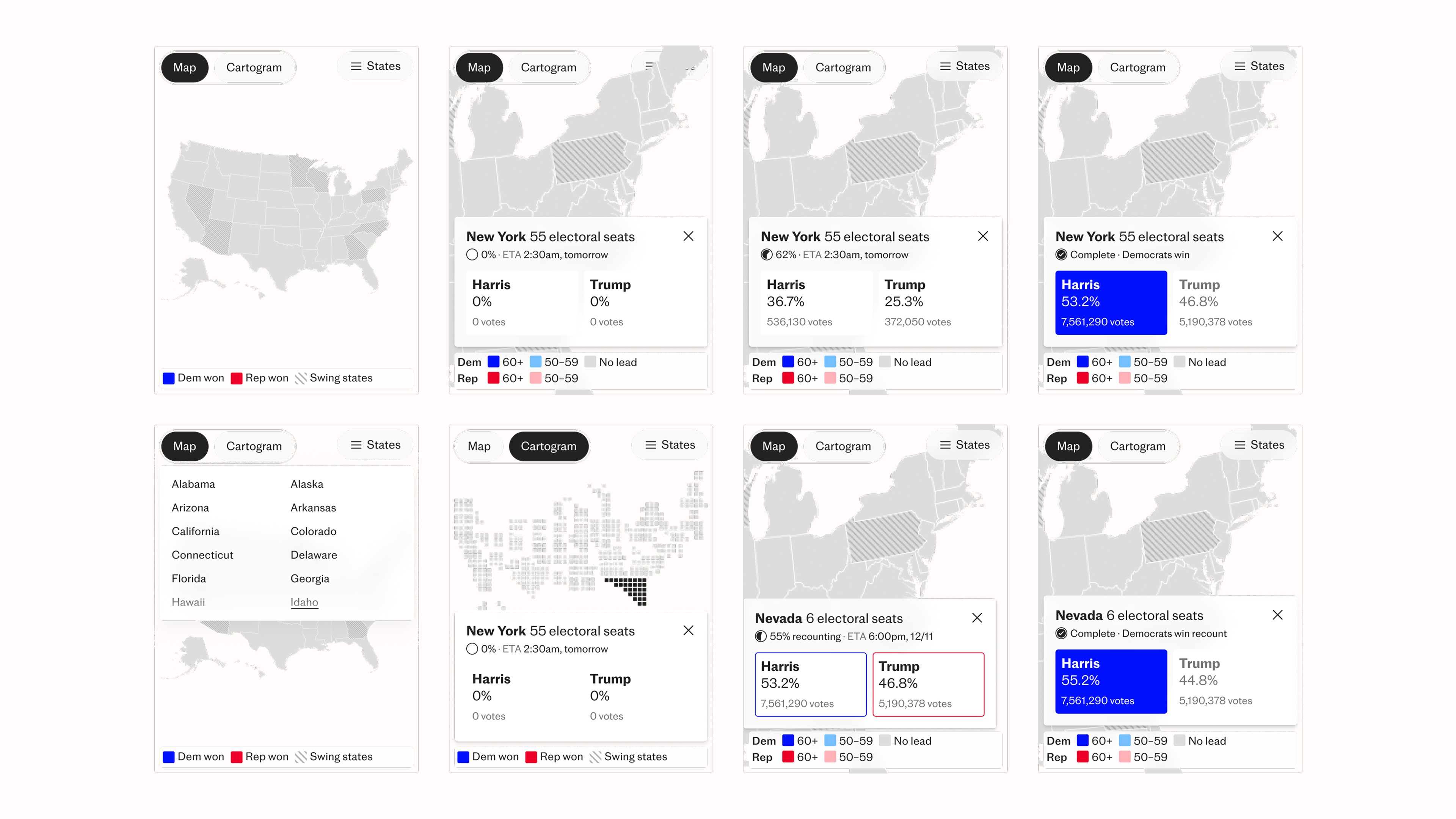
I reviewed approaches from the Guardian, New York Times, Bloomberg, Financial Times; as well as US-specific ones: CNN, ABC, and FOX, focusing on the strengths and shortcomings, battleground (swing states) framing, and live structures. Two patterns informed my plan: a paired geographic map and cartogram for proportional clarity, and a battleground treatment that evolves from pre-election context to live decision tracking to post-election analysis without changing mental models.

Key insights
Discovery dominated: over 50% of the 2020 election traffic arrived via Google, 20% were from the US and more than 90% came from non-subscribers, so the experience had to deliver immediate value then create clean routes into tools that could nurture engagement, namely discussion through commenting, and support subscriber conversion.
Subscribers value an established theme around the event. A strong visual identity and consistency making it feel connected captivated readers. They also valued the live aspect of the event and we should leverage timestamps and real-time updates.
Interest spiked for two weeks around election night, driven by controversy and recount risk, so tools needed to carry explanatory and historical value beyond declarations.
Machine learning modelling of 49–51 percent scenarios stress-tested close outcomes and informed a modular architecture that could update emphasis and structure within minutes as the night unfolded. It helped the Telegraph outperform competitors in accuracy and reliability.
Solutions
Primaries
The Primaries dashboard tracked each party’s candidate races over months with a map that filled as states voted, click-through state views that revealed candidate leaderboards, and a timetable of upcoming primaries and caucuses for planning for US-based readers. The focus was on building an data-led experience requiring minimal journalist intervention while recruiting US talent ahead of the main race in mid-2024.


To promote the Primaries and the main candidates for each particle, I conceptualised using the Storycard article template to tell the story of the race so far and the main candidates for each party, acting as an explainer for British audiences.

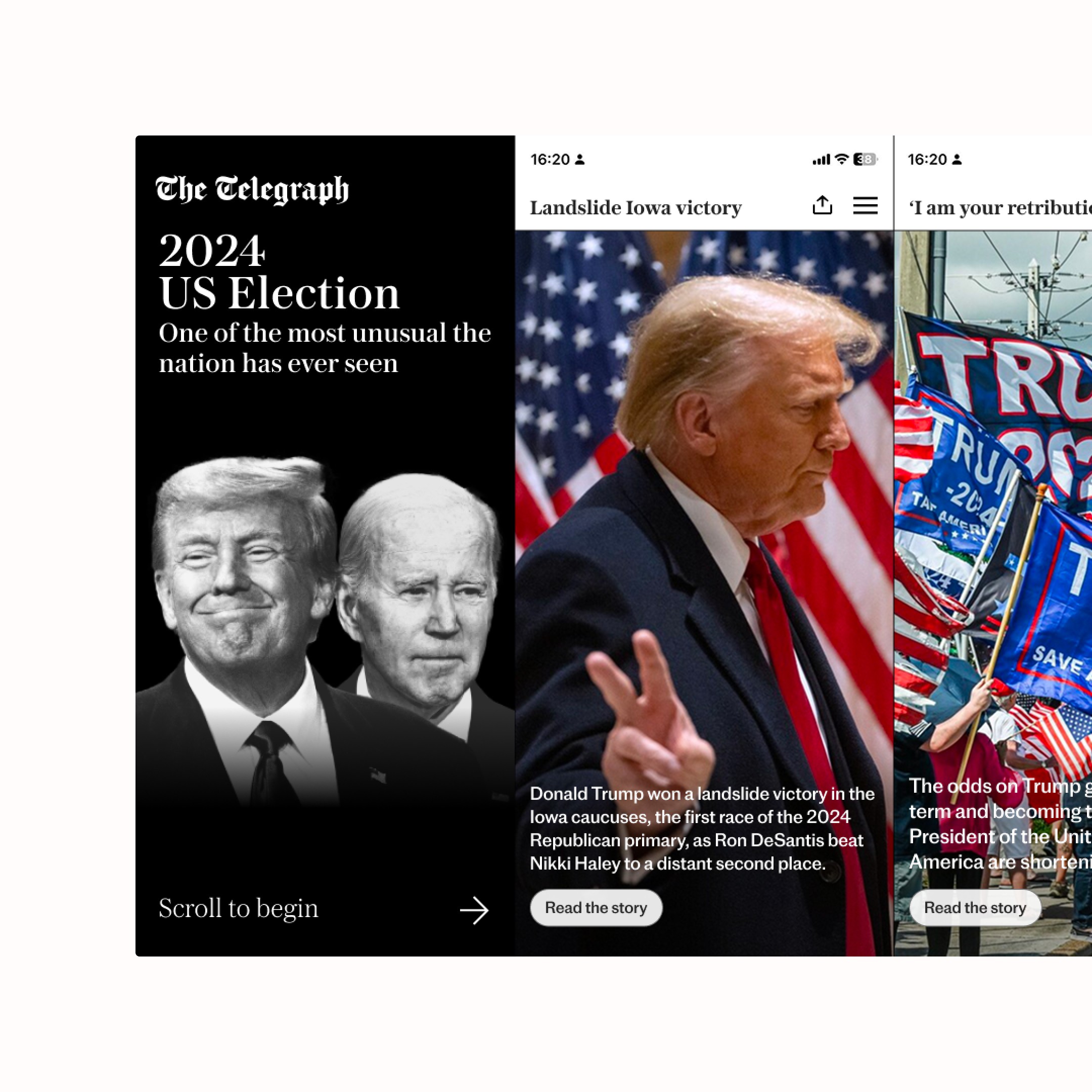
Homepage
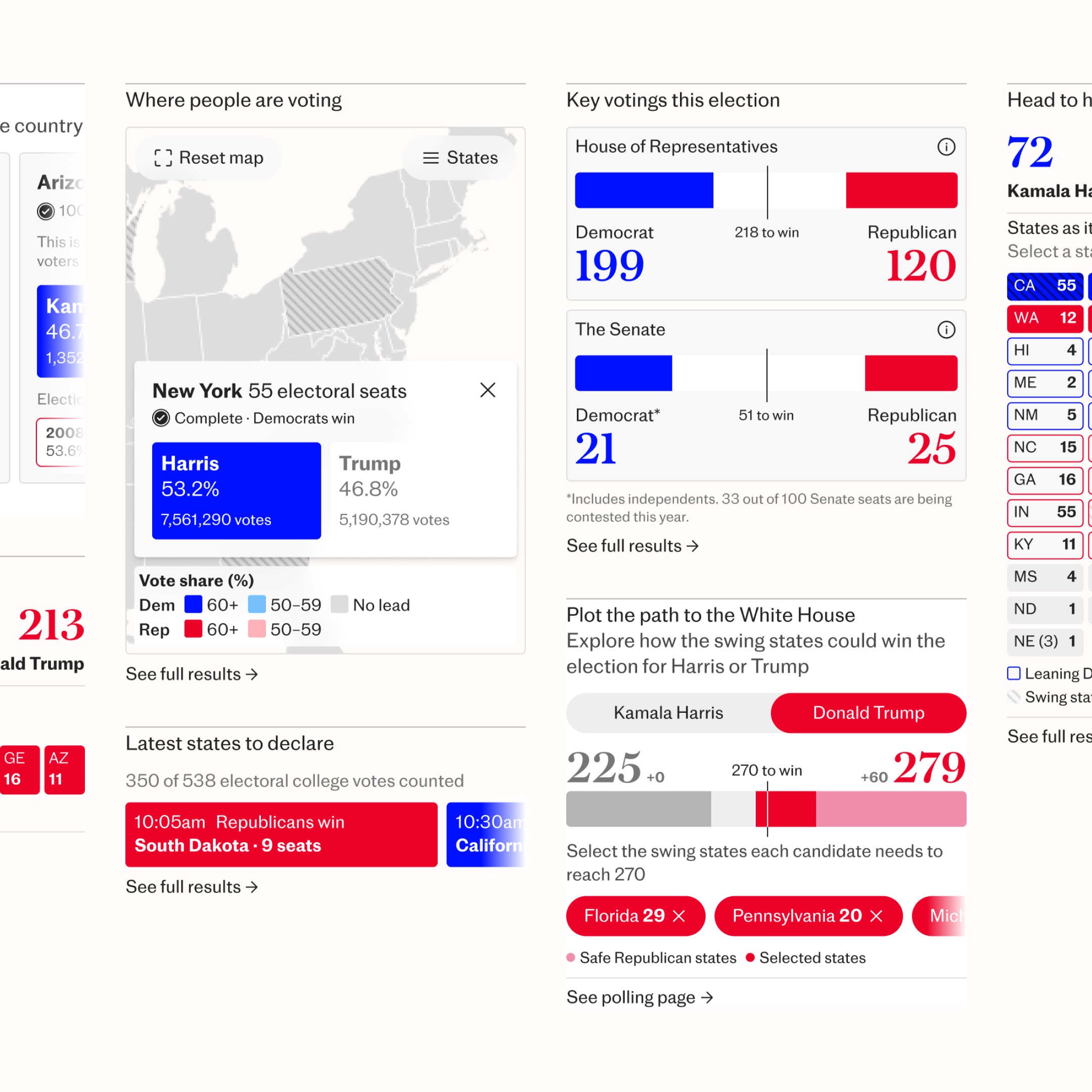
The head-to-head and swing state particles brought significant value and a live feel to the app and homepage, while clear routing into the results page enabled deeper exploration. This approach gave editors ready-to-deploy tools that could be rearranged as other news broke.


To aid this, I prepared preset homepage layouts with editors to cover pre-election build-up, live election night, and post-results follow-through. This gave editors an idea of key stakeholder’s vision so they could fallback on election night and react quickly to developments.


Results
The results page was composed almost entirely from configurable particle blocks that editors could reorder sections throughout election week with minimal developer support on election night. Its main feature was the map and cartogram, so readers could see where voting was happening and which states were important.

Particles were used throughout the app leading up to, and on, results night. All anchored by strong navigation that linked users between key analysis, live blogs and real-time data. In the weeks leading up to the election these were heavily interacted with by readers.

Notifications
Having been validated in the General Election, notifications were improved for use across the homepage, results, and key US destinations on both web and app, delivering live updates that deep-linked to an exact state view on the map. These were separate from iOS notifications and rules were set in place to ensure proper UX, avoiding spam and ensuring true value was provided.
Inauguration in January
An interactive article was commissioned around the Inauguration’s guest list with the concentration of tech leaders and VIPs becoming a story in itself. The tool let readers explore a photo from Trump’s oath ceremony and discover who was present, designed and delivered in a single day with senior leadership to meet timely interest. It was a first of its kind for the Telegraph.
Design system
Work on the General Election and Paris Olympics gave me validated components that I refined and extended for the US coverage, which reduced build time and ensured consistent behaviour across web, app. My work on these three projects established frosted glass at scale, standardised maps and interactions across the site.

To support other design teams - print, social, video and marketing - I developed a style guide during the Primaries, that was reused for the General Election to ensure consistency across platforms. As well as, developing reusable social card templates that could be rapidly created and posted to channels.


Build
Requiring almost the entire Digital Innovation squad and to a relatively short timeframe. During QA and at times, I sat side by side with engineers to spitball and test ideas in real time, rapidly iterating toward solutions that balanced performance, clarity, and newsroom needs. Such close collaboration helped cut build time and ensured smooth addition of design system components to their tech stack. In parallel, I prepared editor-facing documentation, mockups, and live briefings to keep teams in London and Washington aligned in the build up to, and, throughout election night.
Results
Outcome
Coverage set records for daily active subscribers in the app at 367.5k and for reaching 9.1m subscriber page views on election night. Beating out the General Election. Across the 15 days around election night, there were 160k+ new registrants and more than 45m page views, alongside record subscription-page views on web and app, proving users were subscribing or taking out trials. Internally, the US election was praised for setting the second-best STARs (the internal metric for article success) day ever at 19k.


Retrospective
With editors, I helped facilitate a post-mortem and there were many interesting findings. The modular approach, homepage integrations, and real-time map patterns were validated, with editors calling out the swing-focused views and live components as especially impactful for rapid decision-making. As it was relatively close to the General Election, the newsroom felt prepared but better earlier cross-discipline alignment and better workflow management for journalists could have ironed out any creases.
Project credits
Creative
Ryan Nevill
Senior Designer
Jake Cook
Motion
Digital Innovation
Oliver Edgington
Director of Innovative Product
George Loakeimidis
Lead Developer
Alexander Ivanov
Senior Developer
Miles Barriball-Saw
Senior Developer
David Green
Senior Developer
Product
Cali Mackrill
Principle Product Designer, General Election
Kevin He
Product Designer
Visual Journalism
Rachel Jones
Head of Visual Journalism
David Stevenson
Head of Visual Journalism
Connor Ibbetson
Senior Special Projects Journalist
Meike Eijsberg
Data Journalist
Ollie Corfe
Data Journalist